2025

Tool redesign · Web + Mobile · 20k active users

Two months of design. One week of live testing. A tool that has to work the first time, every year.

Two months of design. One week of live testing. A tool that has to work the first time, every year.

Sole designer and de facto product manager for the Activities Tool, Slush's event discovery and management platform serving 500+ events and four distinct audiences: attendees browsing and registering, partners tracking leads and promoting their events, community organizers reaching a niche audience, and Slush's own team curating and supporting the function.

I owned the full platform-facing surface end to end: browsing, search, filtering, event pages, registration, event creation, and organizer management. I set the design direction, defined the constraints, and made the prioritization calls. There was no PM on this project; I filled that role. The CTO and Head of Tech were my primary review partners, pressure-testing designs and flagging gaps before handoff.

key outcomes overview

50+ screens and states designed across 5 surfaces.

Full set of toast and push notification copy rewritten.

New component patterns for cards, filters, registration, and creation flows.

Search, waitlist logic documents & documentation for handoff.
Some context

Slush is a global startup and tech event connecting founders, investors, and operators. The event runs on a digital platform: a suite of tools that serves over twenty thousand attendees each year. The Activities Tool is where those users discover, register for, and manage 500+ events happening during the Slush week.

Slush is a global startup and tech event connecting founders, investors, and operators. The event runs on a digital platform: a suite of tools that serves over twenty thousand attendees each year. The Activities Tool is where those users discover, register for, and manage 500+ events happening during the Slush week.

The tool fell behind the user's expectations.

The tool fell behind the user's expectations.

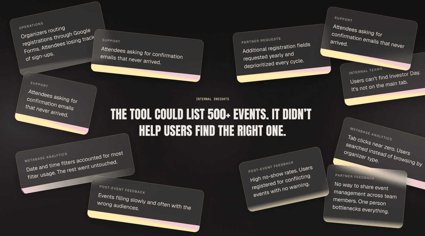
The Activities Tool had grown into two disconnected halves. The browsing side listed hundreds of events but didn't help anyone find the right ones: no personalization, a tab system with almost no engagement, and a layout that treated every event the same regardless of the user's role or interests. The creation and management side was even worse.

Read more

PROJECT
CHALLENGES

PROJECT
CHALLENGES

Challenge 01

One shot per year to get it right

Challenge 02

No mature product function to lean on

Challenge 04

Four audiences, one surface

From three years of signal to a unified event tool

Post-event feedback, platform analytics, and partner requests accumulated over three years gave me a clear starting point. I synthesized the data and scoped the redesign with the CTO, prioritizing the browsing side first for its breadth of visual changes and user impact, while the creation and management scope finalized in parallel.

Read more

Analysis & prioritization

Analysis &

prioritization

Browsing redesign (iterative)

Browsing redesign (iterative)

Creation & management

Creation & management

Documentation and DS update

Documentation

and DS update

Handoff

Handoff

Analysis & prioritization

Three years of post-event feedback, Metabase analytics, and accumulated partner requests provided the signal. Filter and tab usage data revealed what users actually reached for and what they ignored, which set the direction for the browsing redesign. I scoped and prioritized features with the CTO.

Three years of post-event feedback, Metabase analytics, and accumulated partner requests provided the signal. Filter and tab usage data revealed what users actually reached for and what they ignored, which set the direction for the browsing redesign. I scoped and prioritized features with the CTO.

Iterative design

The browsing side carried the most surface area and the hardest audience tensions, so it started first. The creation and management side followed once scope was locked. The design process was iterative; this phase took the most time and produced the largest volume of decisions.

The browsing side carried the most surface area and the hardest audience tensions, so it started first. The creation and management side followed once scope was locked. The design process was iterative; this phase took the most time and produced the largest volume of decisions.

Handoff & support

Handoff extended over several months alongside other projects. I supported engineers on interaction details and edge cases as features went live, going back and forth between this and other work as implementation progressed.

Handoff extended over several months alongside other projects. I supported engineers on interaction details and edge cases as features went live, going back and forth between this and other work as implementation progressed.

DESIGN DECISIONS

So, a lot happened. This is how it's organized.

This section works like the product it describes. Pick a surface from the sidebar, open the decisions that interest you, skip the rest (or maybe don't?). It's a case study about browsing; it would be strange if you couldn't browse it.

Design decisions

Activities Tool ›

Search & filtering

Discovery

Search & filtering

Event creation

Management

Event page

Search & filtering

Unified search across all event types and restructured filters around actual usage data.

  1. Cross-category search

Results across all event types; filter suggestions when keywords match structured terms.

The previous search was scoped to the active tab. A user on the "Side Events" tab couldn't find an Investor Day event because it lived on a different tab. Search and content were structurally misaligned.


Search now returns results across all event categories in a single view. When a keyword matches a filter term, the search suggests that filter directly, so users move from a keyword to a structured query in one step. This closes the gap between searching and filtering; they're no longer separate actions.

The filter suggestion mechanic runs on pre-mapped aliases. Users searching "startup" might mean "Target audience:founders" or "Ticket requirement: startup". Suggesting the structured filter when the keyword matches avoids the dead-end of a text search.

  1. Card redesign

Square banner, hover save, date/time priority in reading order.

Design decisions

Activities Tool ›

Search & filtering

Discovery

Search & filtering

Event creation

Management

Event page

Search & filtering

Unified search across all event types and restructured filters around actual usage data.

  1. Cross-category search

Results across all event types; filter suggestions when keywords match structured terms.

The previous search was scoped to the active tab. A user on the "Side Events" tab couldn't find an Investor Day event because it lived on a different tab. Search and content were structurally misaligned.


Search now returns results across all event categories in a single view. When a keyword matches a filter term, the search suggests that filter directly, so users move from a keyword to a structured query in one step. This closes the gap between searching and filtering; they're no longer separate actions.

The filter suggestion mechanic runs on pre-mapped aliases. Users searching "startup" might mean "Target audience:founders" or "Ticket requirement: startup". Suggesting the structured filter when the keyword matches avoids the dead-end of a text search.

  1. Card redesign

Square banner, hover save, date/time priority in reading order.

REFLECTION

Cross-department requests for comparison work dropped by more than half within three months of launch.

Cross-department requests for comparison work dropped by more than half within three months of launch.

Cross-department requests for comparison work dropped by more than half within three months of launch.

The redesigned Activities Tool went live for 2026 and is currently in its first full event cycle. Quantitative impact (registration rates, fill times, no-show reduction, creation-to-publish time) is being measured against 2024–2025 baselines and will be updated after the event.

Initial feedback from partners and internal teams has focused on the event creation and management views: the on-platform registration fields and multi-manager support resolved pain points that had been flagged for multiple years. The tool was tested with the tech team and key stakeholders in a structured session after which some elements of the creation flow were moved around.

Personal thoughts

Personal thoughts

The design was handed over in parts so that engineering could start building while other surfaces were still being finalized. On a tool this size, with independent views (browsing, creation, management, event page), that parallel handoff kept the compressed timeline viable. I'd do it again, but earlier: scoping the handoff sequence at the start of the project rather than deciding it as design progressed would have reduced the back-and-forth during implementation. On a yearly cycle with one live window, every week of implementation friction is a week of testing lost.

XXX

Impact is still to be measured.

MORE SCREENS

  • NEXT UP → TICKET MANAGEMENT

  • NEXT UP → TICKET MANAGEMENT

  • NEXT UP → TICKET MANAGEMENT

Full case study

  • NEXT UP → TICKET MANAGEMENT

  • NEXT UP → TICKET MANAGEMENT

  • NEXT UP → TICKET MANAGEMENT

Full case study

GET IN TOUCH.

Always open to new collaborations

or just a chat about design systems.

GET IN TOUCH.

Always open to new collaborations

or just a chat about design systems.

GET IN TOUCH.

Always open to new collaborations

or just a chat about design systems.

GET IN TOUCH.

Always open to new collaborations

or just a chat about design systems.