2025
Tool development · Internal software · Web · 20k active users
Disclaimer: this is an NDA project, some aspects of the designs and the data visible on the screens was altered.
The platform is an energy reporting tool built for utilities and large industrial clients. Facility managers and operations teams use it to submit and store reports on consumption, emissions, costs, and other metrics specific to each client's needs. Any comparison or analysis meant requesting it from the analytics team, who worked in their own tools entirely outside the platform.
The brief was broad: a platform improvement that would bring analytics into the tool. As the sole designer, I led validation, customer log research, and scoping the open questions that still lacked answers from the client side.
key outcomes overview
Two-layer comparison system: in-report and cross-report, scoped to two distinct user workflows.
Annotation canvas and anomaly detection, turning static charts into an interactive analysis tool.
40+ screens designed; updated components contributed back to the design system.
Challenge 01
No existing model for comparison
Challenge 02
Workarounds that worked well enough
Challenge 03
Users I couldn't reach
Challenge 04
A design system built for static content
Stakeholders had no direct access to customers, so I relied on secondary research to scope the problem: post-launch support logs, customer records, and a Day in the Life reconstruction already held enough signal to start without running new primary research.
Read more

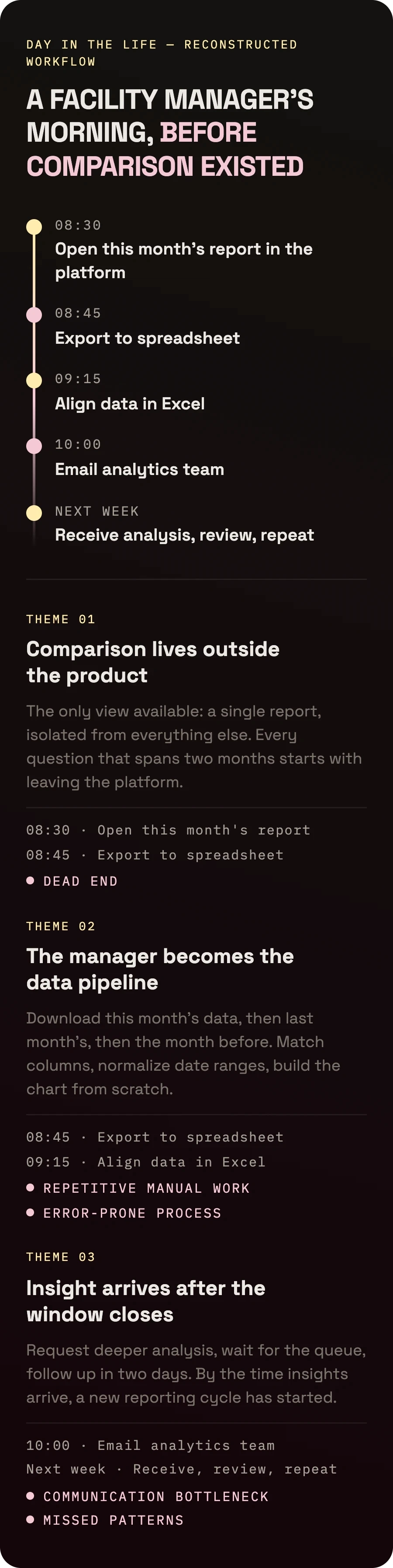
From converging signals to a shipped comparison feature.
Validation, stakeholder alignment, and early concepts ran in parallel rather than sequentially. With no direct access to users, I had to build confidence in the direction through converging signals from multiple sources at once.
Research & validation
Feature scoping & design
Handoff & support


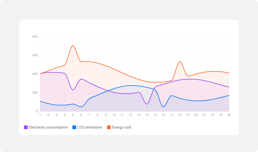
Users could already view reports by week, month, or day, but comparing two periods meant exporting each one separately, combining them manually, annotating in a third tool, and forwarding the result. I expanded the existing time controls to support period overlay directly within the report, collapsing that entire workflow into one view.
Read more

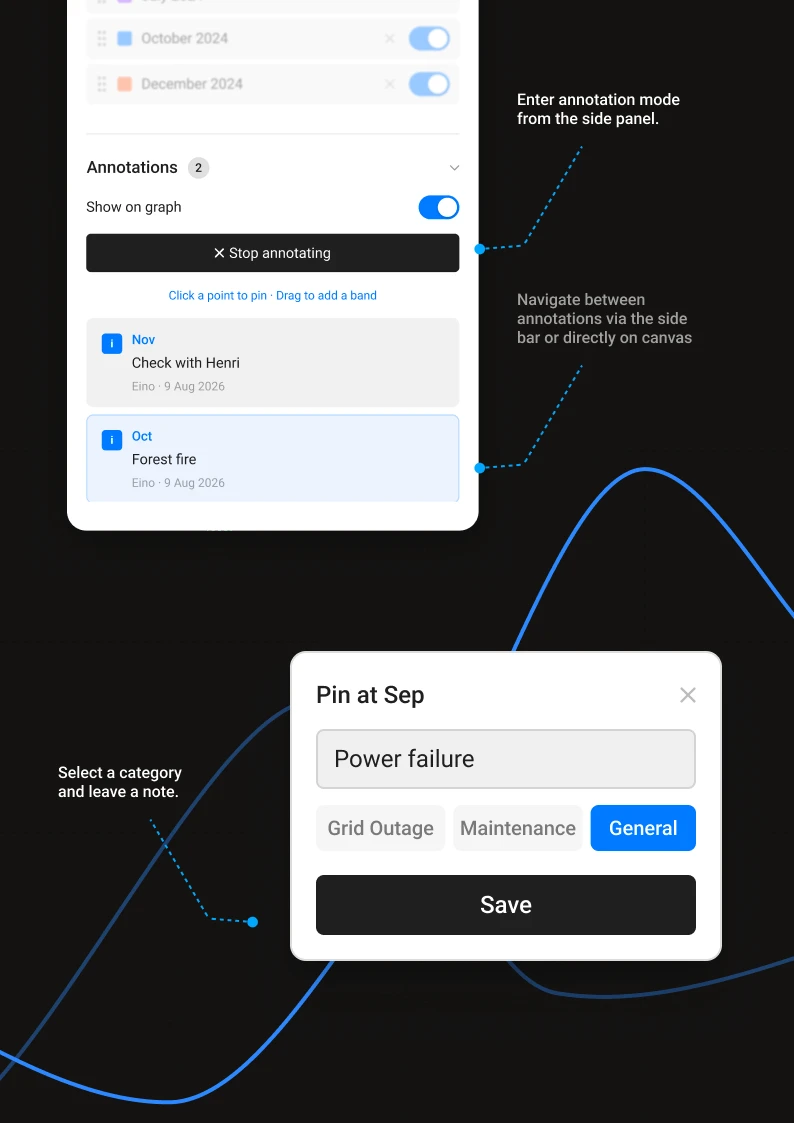
Features I proposed beyond the brief
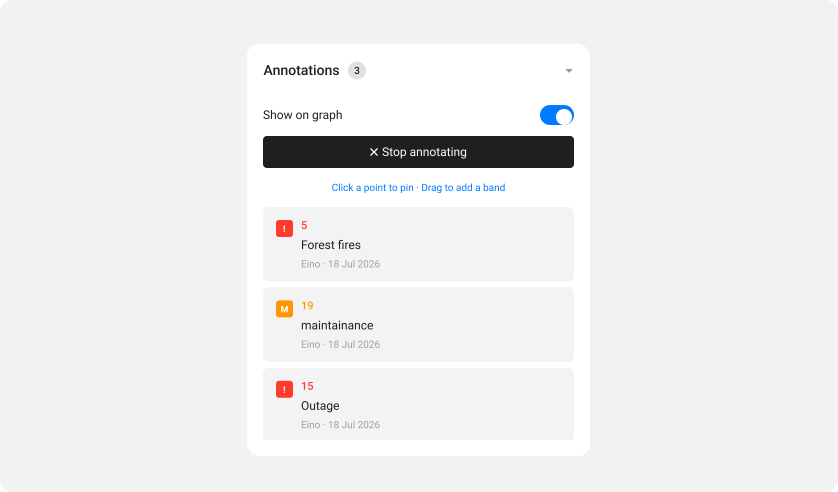
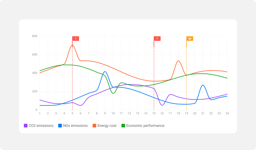
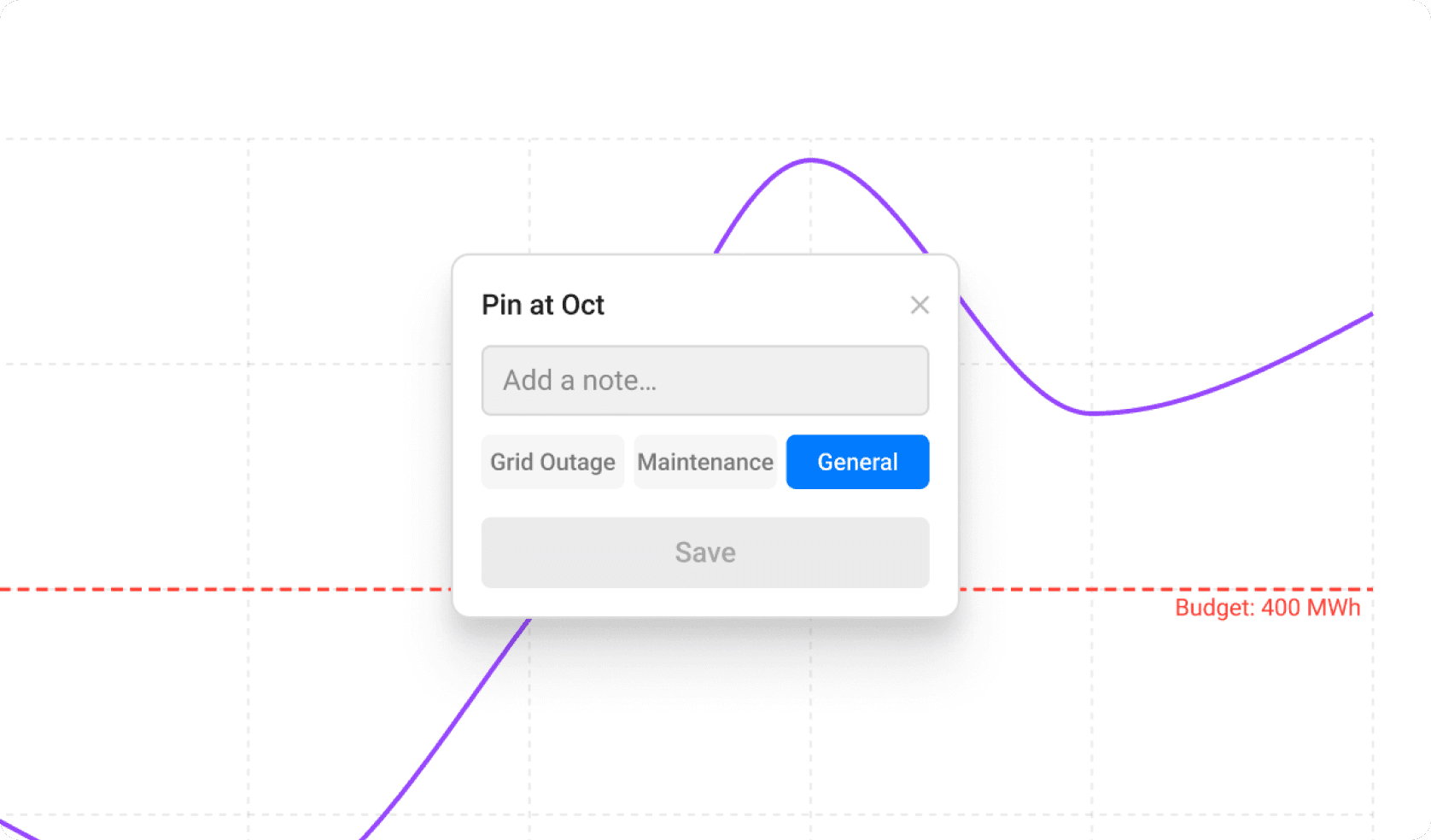
Annotations are pinned directly on data points and populate automatically in the settings column; clicking an entry highlights its position on the chart and vice versa, keeping communication on the canvas rather than in a separate thread.
Anomaly detection works through admin-set reference lines that define what "normal" looks like for a given report, visually flagging data points that deviate beyond a set threshold.
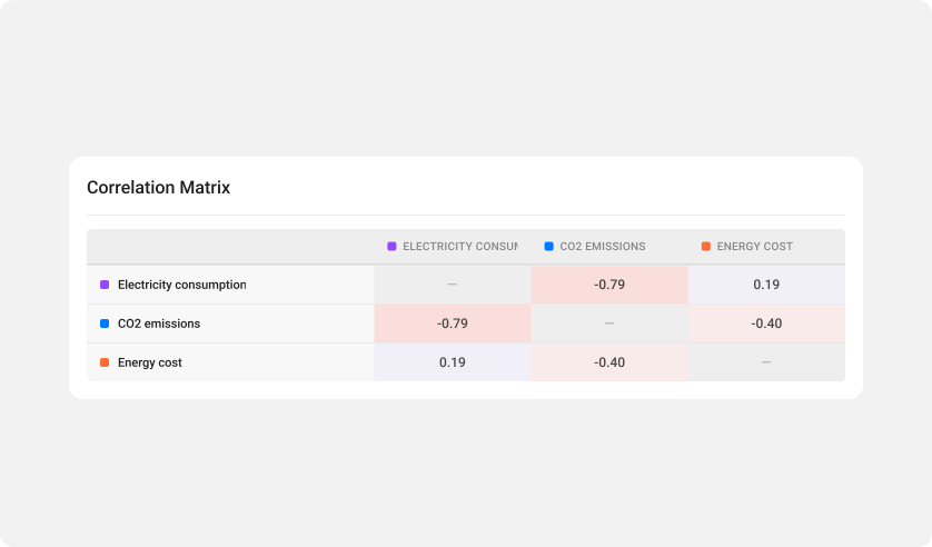
In-report comparison handles a quick check within one context. Comparing across reports is a different task entirely: the user creates a new comparison report, combining data from multiple sources to track dependencies over time. These reports are private by default, so the user can experiment, tweak, and iterate without the rest of the team seeing unfinished work.
Read more
Designing for a user base that didn't ask for this
Every decision in this project carried the same constraint: five years of entrenched habits and no guarantee of adoption. I kept comparison inside the existing report view rather than introducing a new section. Cross-report comparison starts private so users can learn without visibility. Annotations and anomaly flags activate independently rather than shipping as a default. Each choice reduced the cost of trying the feature for the first time, because a tool nobody opens solves nothing.
Comparison was the most requested feature the platform had never addressed. When it shipped, managers adopted it without onboarding or training because the controls built on patterns they already used: the same time selectors, the same report structure, just with a second period layered in. Annotations and anomaly flags followed the same pattern, averaging 4 to 5 per report across active users within the first quarter.
The brief was written by domain experts who understood the industry down to the unit of measurement. I came in with none of that context and spent the first weeks building knowledge on my own before bringing questions to the team. The research gave me a perspective the team hadn't considered, but it made the early iterations slower than they needed to be. If I were starting this again, I'd front-load structured conversations with the team from the get go.
120+
Reports created and shared across teams in the first quarter.
~60%
Fewer requests routed to the analytics team for comparison work.